
")
Welcome to our latest portfolio showcase, where we’re thrilled to take you on an exciting journey through our recent collaboration with the incredible Life Coach, Katie Volk. This project has been a true testament to the power of colors in branding, and we can’t wait to share all the vibrant details with you. Join us on our Journey Through Our Colorful Branding Project with Life Coach Katie Volk.
The Vision
From the very beginning, it was clear that Katie Volk’s coaching approach was anything but ordinary. Her dynamic personality, positive energy, and unique coaching methods deserved a branding identity that was equally exceptional. Our challenge was to encapsulate her essence into a visual identity that not only stood out but also resonated deeply with her target audience.
Capturing the Essence
Our initial consultations with Katie were incredibly insightful. She shared her personal journey, coaching philosophy, and the emotions she wanted her brand to evoke. It was evident that the core of her coaching lay in inspiring transformation, growth, and empowerment. With this in mind, we began brainstorming concepts that could encapsulate these qualities.
The Power of Colors
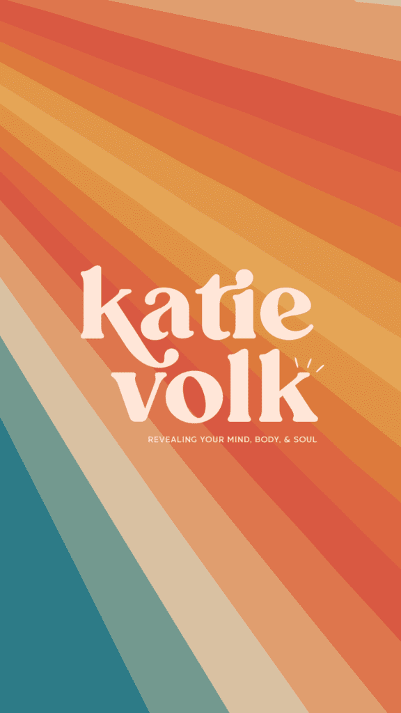
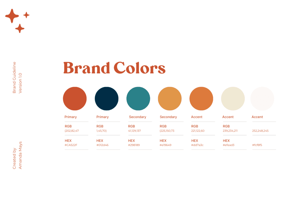
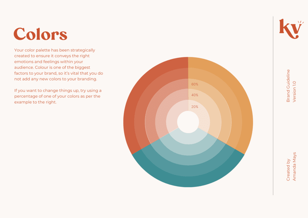
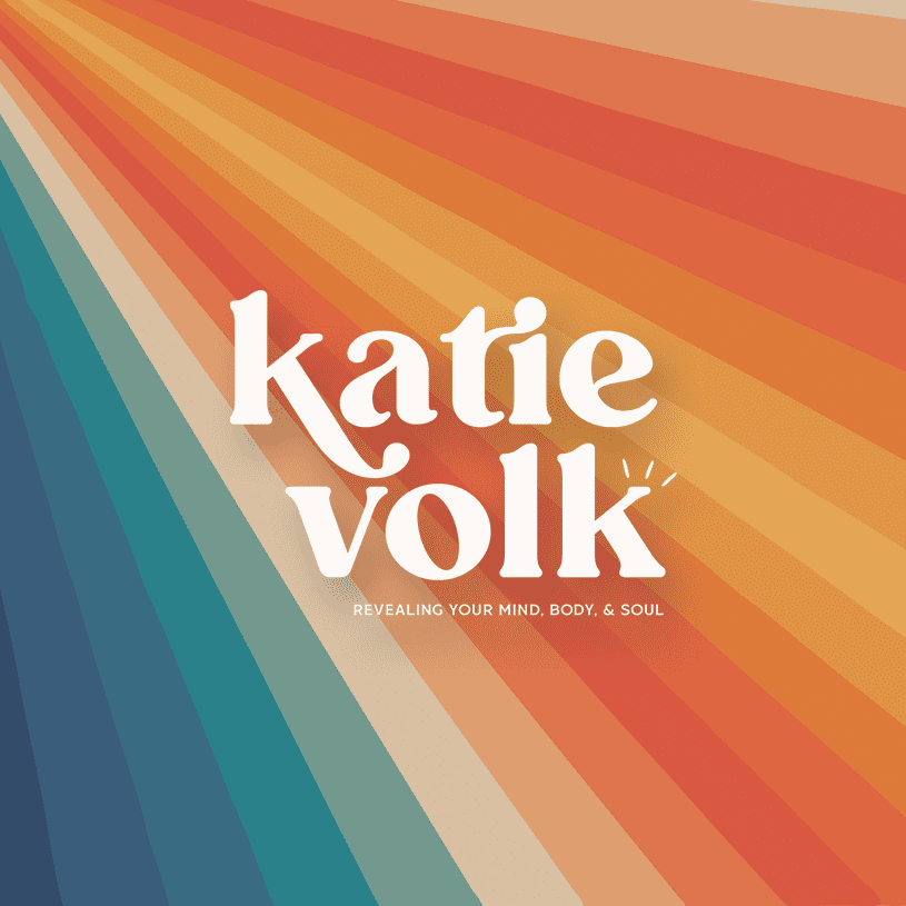
After extensive research and brainstorming sessions, we arrived at a pivotal decision: colors would be the cornerstone of Katie’s brand identity. We delved into color psychology and explored hues that would mirror the emotions she aimed to evoke. The result? A vivid and bold palette that spoke volumes:
- Sunny Yellow: Radiating positivity, optimism, and enlightenment – key emotions for embarking on a transformative journey.
- Energetic Orange: Representing vitality, action, and determination – a call to take proactive steps towards personal growth.
- Tranquil Teal: Evoking calm, balance, and clarity – qualities essential for the coaching process.
Bringing the Vision to Life
With our color palette in hand, we embarked on the journey of crafting Katie’s brand elements:
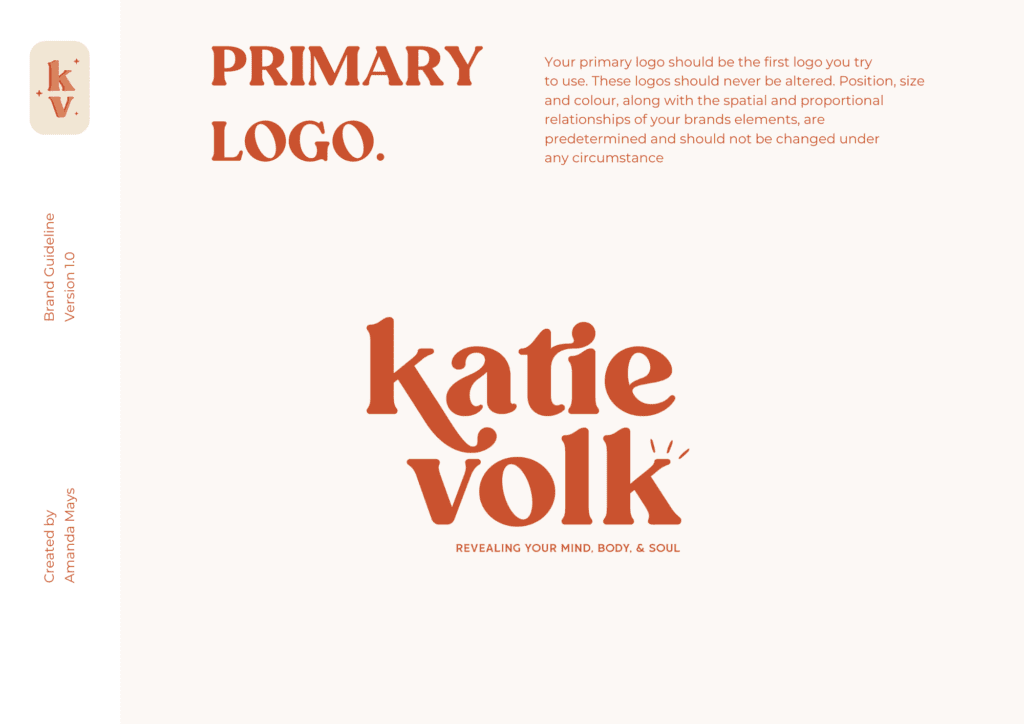
Logo Design
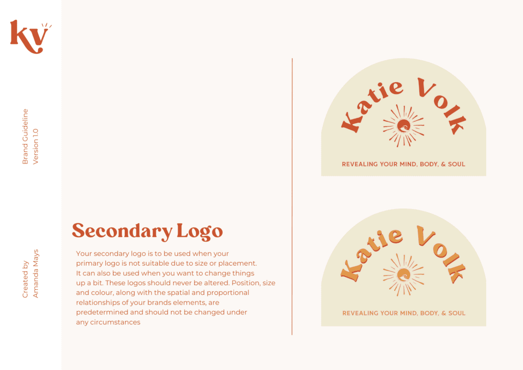
We designed a logo that incorporated the vibrant colors that gave a nod to a vintage 70’s assestic. This symbolized the holistic and dynamic approach Katie takes towards coaching, where various aspects of life are interwoven for a comprehensive transformation.
A Colorful Future
Our partnership with Katie Volk on this branding project was a true privilege. It demonstrated that colors are not just visual elements; they’re powerful tools that can tell stories, evoke emotions, and create lasting impressions. The success of this project reinforced our belief in the significance of understanding a client’s vision deeply and translating it into a visual language that resonates.
As we wrap up this chapter of our portfolio, we’re excited to see Katie Volk’s coaching journey flourish with her newfound colorful identity. If you’re ready to embark on a transformative adventure, guided by positivity and empowerment, be sure to connect with Katie Volk.
Stay tuned for more captivating projects as we continue to bring visions to life through the world of design and branding!
Need a new showit template? I’ve got your hook up! https://amandamays.com/store
Ready to try Showit? Get a free month of showit on me! https://account.showit.co/r/d1l85vzr
Ready to build your email list? Save 50% on flodesk https://flodesk.com/c/AMANDAMAYS
Ready to organize your client workflow? Try Honeybook for 1$ for the next 6 months! http://share.honeybook.com/amanda72593
Want to record your screen like me? https://loom.grsm.io/jp1rp3wil8mp

